
UX lessons learned from eCommerce projects
In this article, I will present a general overview of some of the lessons and UX best practices that I’ve learned throughout my 4-year career working on eCommerce projects.

I have worked as a certified Magento 1 and Magento 2 frontend developer for an eCommerce agency for 4 years. I’ve developed and maintained several webshops ranging from small scale to enterprise shops and I’ve audited numerous websites for frontend performance and UX.
After moving onto non-eCommerce projects, I’ve noticed that I could apply the lessons I’ve learned while working on eCommerce to create very user-friendly and performant frontends with great UX features.
In this article, I will present a general overview of some of the lessons and UX best practices that I’ve learned throughout my 4-year career working on eCommerce projects.
Reduce user’s effort where possible
An eCommerce website can make the shopping experience as clear and simple as possible by providing various helpful features:
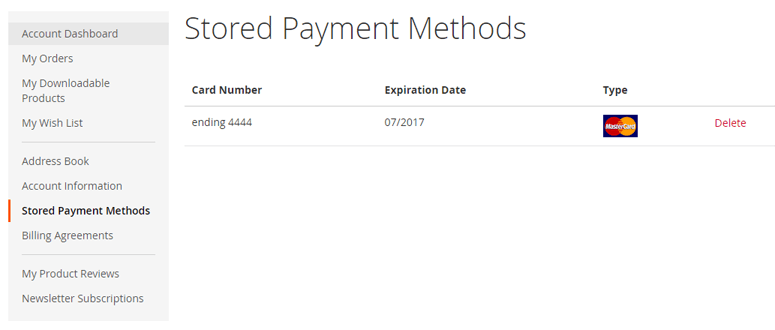
- Saved billing & shipping addresses
- Saved payment methods
- Easy login (social media login)
- Fast checkout with saved customer details
- Customer wishlist
- Clear shopping flow (uniform CTA elements)
- etc.
By reducing the effort that the user has to invest in shopping and focusing the effort only on areas that require it, we can increase the conversion and overall revenue.
With that in mind, we can work on reducing the user effort by offering the user various ways of speeding up and simplifying the flow. It’s important to take note of repeating processes in the flow and processes that could be automated or sped up.
Header & first impression of a website
Header and its navigation represent the webshop brand, informs the customer about types of products and services that it offers and provides helpful information.
It has several functions:
- Represents the brand (with logo)
- Navigation gives a general overview of the product catalog (top-level categories)
- Displays account state (guest or logged in)
- Displays cart state (amount of products in the cart)
- Displays a search element (input or a toggle)
- (optional) Provide only the most helpful links (FAQ, billing, shipping, returns, etc.)

Looking at the header, the customer needs to become familiar with the branding and instantly know what kind of content and general topics that can be found on the website. Alongside that, the header needs to provide helpful tools and links that can make the site navigation easier.
Call To Action elements
In eCommerce, Call To Action (CTA elements) need to have the most visual weight on the page, be uniform and lead the user down the path from browsing the product catalog, adding individual product(s) to the cart, and successfully finishing the checkout.
For example, the “Subscribe” button on a Newsletter element should have less visual weight than the “Add to cart” button.
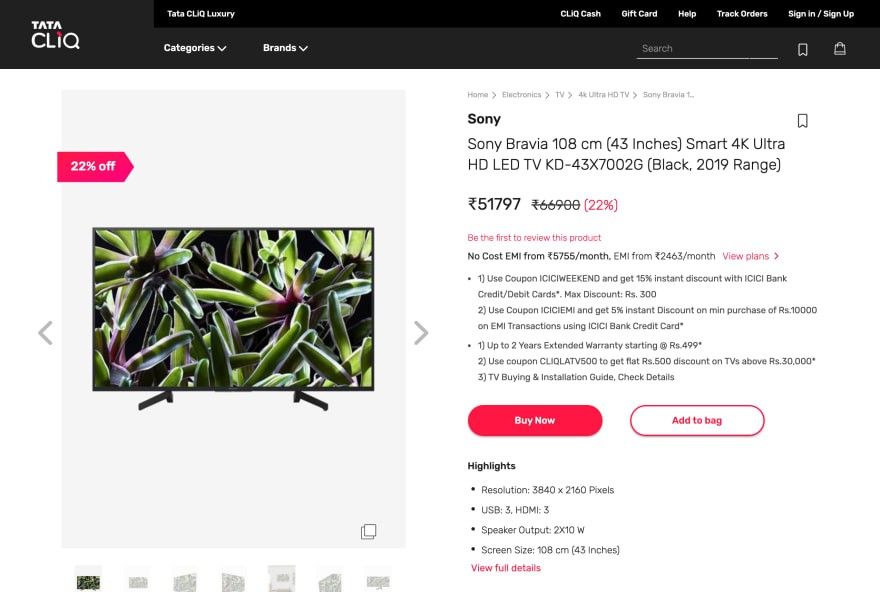
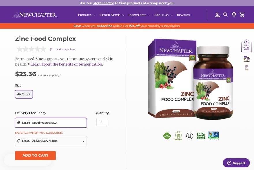
CTA elements that have the most visual weight on the site need to guide a user in the main website flow or the flow they choose to follow. Having many CTA elements on the page can be confusing to the user, so it’s important to establish an element hierarchy and use the appropriate element for a context (primary flow, secondary flow, optional flow, etc.).
Importance of responsive design
There are more users accessing the web from a mobile device than a desktop device, so more and more customers are using mobile devices to shop online. More and more websites focus on having a great, if not superior, UX on mobile and tablet devices. Revenue and number of purchases on mobile and tablet devices continue to grow year after year.
“79% of smartphone users have made a purchase online using their mobile device in the last 6 months
Almost 40% of all eCommerce purchases during the 2018 holiday season were made on a smartphone.”
- Source: Mobile eCommerce Stats in 2018 and the Future Online Shopping Trends of mCommerce
By using analytics tools like Google Analytics, we can determine the ratio of users using mobile devices to users using desktop devices and track various metrics (like conversion rates) for each group. Website owners and management can make various decisions when improving the site or planning new features.
Every second of loading time matters
How much does each second of loading cost?
“Pages that loaded in 2.4 seconds had a 1.9% conversion rate.
At 3.3 seconds, conversion rate was 1.5%.
At 4.2 seconds, conversion rate was less than 1%.
At 5.7+ seconds, conversion rate was 0.6%.”
- Source: Cloudflare — How Website Performance Affects Conversion Rates
It’s not all that surprising that users will abandon the site if it loads too slow. In the context of an eCommerce site, if a user abandons the site due to the large loading times right before checking out, it results in a revenue loss.
Many webshops found that improving the loading times and optimizing the frontend and backend resulted in a significant revenue increase.
“Walmart found that for every 1 second improvement in page load time, conversions increased by 2%. COOK increased conversions by 7% by reducing page load time by 0.85 seconds. Mobify found that each 100ms improvement in their homepage’s load time resulted in a 1.11% increase in conversion.”
Source: Cloudflare — How Website Performance Affects Conversion Rates
After working on eCommerce projects, I’ve started optimizing code and asset file size right from the start, eliminating any potential performance bottlenecks right from the start. These bottlenecks and issues are common for all websites.
Using schema.org to describe the content
By adding schema.org tags to a website, Google and other search engines can better understand the site they crawl and display. schema.org is just a collection of simple HTML attributes that can be easily added to websites. There are a lot of use-cases and tags that can describe your website in great detail and can be a topic of a future article due to the number of possible use-cases and options.
Here are some useful links on how to implement schema.org tags
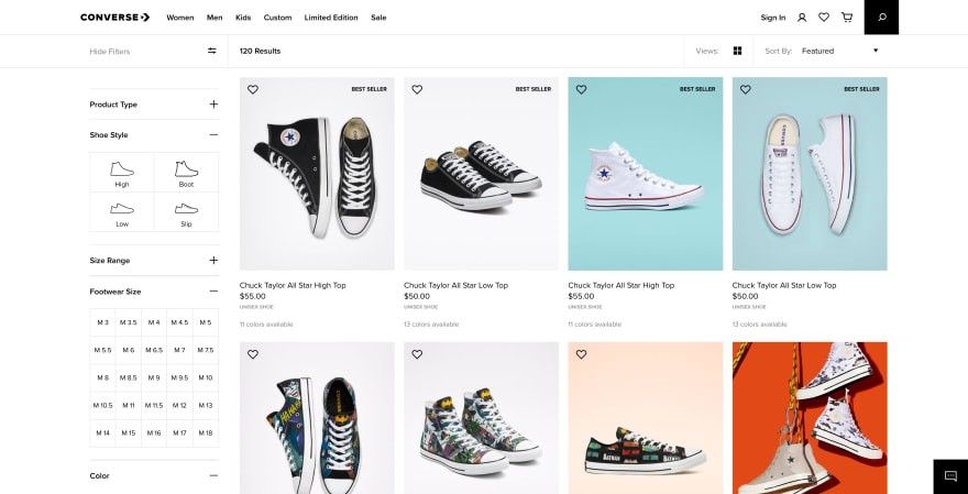
Analyzing user flow to determine performance bottlenecks — category page example
The standard category page consists of a product catalog (displayed in a grid or a list), a toolbar with sorting and display options, layered navigation (filters) and pagination.
This layout usually also applies to the search results page.
From what we know, we can notice the following:
- This page is reloaded each time user interacts with filters, sorting options, display options, pagination or the search page
- Images play the biggest part in page size and number of requests
For example, If there are 24 products displayed on a category page with only 8 items in the user’s viewport on load, we are downloading 16 images that the user might not even see, but it slows down a page load considerably (depending on image size and optimization).
With that in mind, the best improvement that we can do on a category page is to optimize image sizes and add lazy loading.
By following user flow, we can determine potential bottlenecks on the page and optimize them from the start. It’s also helpful to be aware of the type of content that is going to be on the page (images, text, videos) and apply optimization techniques accordingly.
User focus and forms — checkout page example
Removing distracting page elements
When the user decides to check out and buy the items in their cart, we need to ensure that the user doesn’t get distracted and leaves the checkout page. The best way of doing that is to simplify the header and footer (or remove footer entirely). Ideal checkout page consists of the following elements:
- Header with branding only — the user is reassured that they are on the same website, but they are not distracted by navigation and links
- Checkout form — divided into sections or steps.
- Security section (short info, lock icon, etc.) — the user is reassured that the data they provide in checkout (address, payment data, etc.) is safe and that they can trust the website.
Let’s take a look at the example of a simplified page layout on checkout.
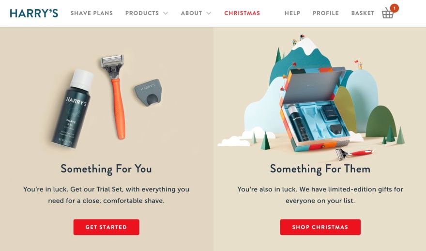
First, let’s take a look at how the header looks like on the homepage.
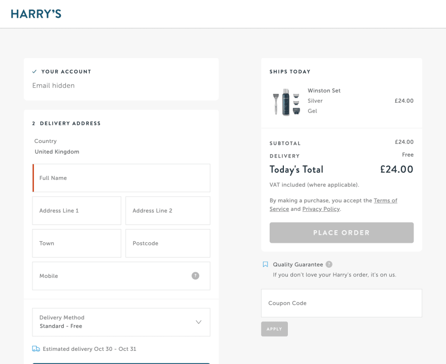
And this is how it looks like on checkout. It keeps the user focused on the checkout form, while reassuring users that they’ve stayed on the same website.
We have the ability to guide the user’s focus while the user browses the website. It’s important to know when we need to reduce the number of distracting elements on the page to focus the user on the important flow or give the user many focus points on the page.
Form layout
Often times, it’s tempting to create multi-column forms, but this can cause some issues. Users can take different paths when filling out those forms.
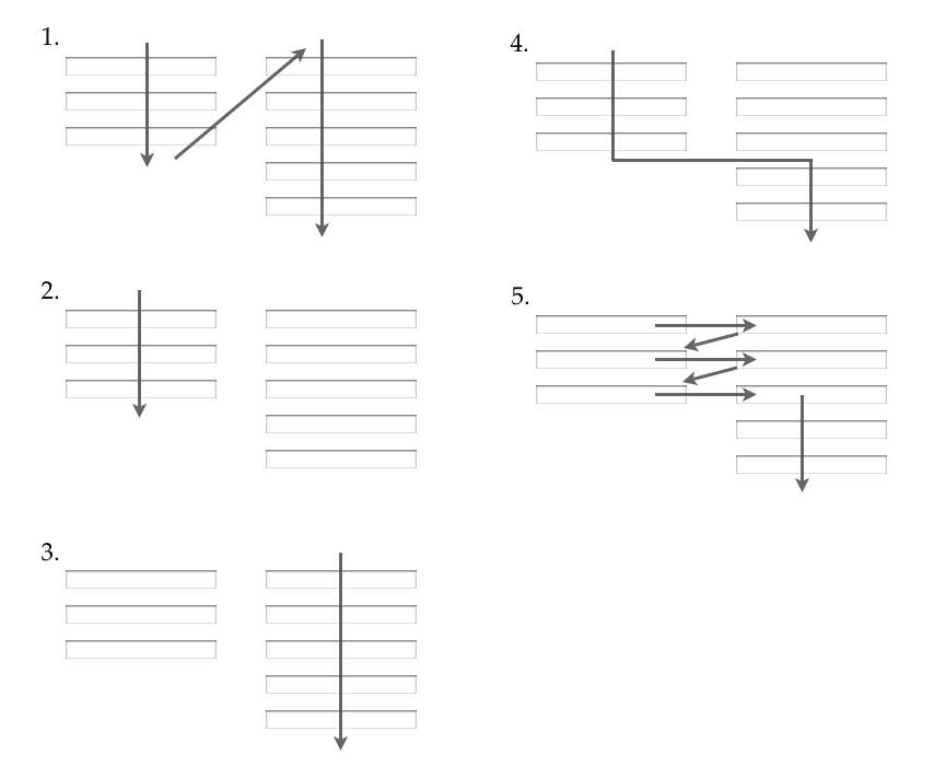
This can become very confusing to the user and they could lose the sense of progression, and might not check out successfully.
By keeping the form inputs in a single column and dividing them into sections and steps customers can scan the inputs more clearly, have a better sense of progression and have a better chance of successfully submitting the form and following the user flow.
Form validation
On checkout, form validation needs to happen as the user is typing data.
If we run validation when the user clicks the “Submit” button and there is an error somewhere in among a handful of inputs, the user needs to go back and find the error and fix it before proceeding. This ruins the user’s sense of progression and doesn’t reassure them that their data is valid in time.
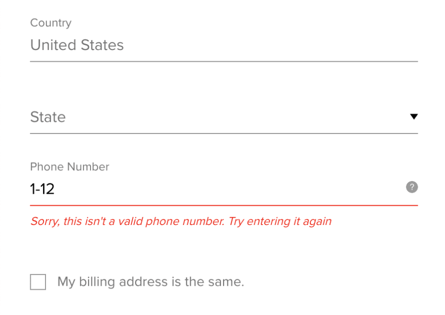
Additionally, required fields need to be clearly marked and their labels need to stand out more prominently in the form.
If the data like address or telephone needs to follow a certain pattern or format, this needs to be clearly communicated to the user via tooltip next to the form.
Additionally, you can also use those tooltips to reassure users that their email and/or telephone number will only be used for purposes important to the website flow and not for promotion (unless the user doesn’t explicitly gives permission).
Looking for more UX best practices?
Micah Bower's awesome article Paving the Path to Purchase – eCommerce UX Best Practices covers more best practices for making your eCommerce website even more usable and customer-friendly.
Conclusion
After 4 years of working in the eCommerce industry, I’ve learned how properly follow the user flow on the page and pinpoint potential performance and UX bottlenecks, various UX best practices, how every second of load time matters, etc. I’ve successfully managed to apply these lessons when I moved onto projects beyond eCommerce and it changed the way I’ve looked at and analyzed the websites.
I hope that you’ve found this article helpful and that you’ll be able to apply these UX improvements in your projects. I’ve only covered a handful of UX lessons I’ve learned, but feel free to share your own UX tips and thoughts in the comments.