
Optimizing images for the web - an in-depth guide
Follow this in-depth-guide and learn different ways to optimize images for your website.


Table Of Contents
- Calculating JPG image file size
- Online image optimization
- Automated solutions
- Image loading optimization
- Using CDN
- WebP image format
- Optimization for higher pixel density screens
- Conclusion - Optimization priority
Unoptimized (non-minified) images are one of the main causes of poor website performance, mainly on the initial (first) load. Depending on the resolution and image quality, you might end up with images that take up more than 70% of your total website size.
It's very easy for unoptimized images to end up on a production site and slow down its initial load considerably. Inexperienced devs usually aren't aware of this potential problem. They also aren't aware of a wide range of tools and approaches for optimizing images.
This article aims to cover most of the tools and approaches for optimizing images for the web.
Calculating JPG image file size
The uncompressed image size can be easily calculated by multiplying image width px value with image height px value and multiply the result by 3 bytes which is equivalent to 24 bits (RGB color system). We divide the result by 1,048,576 (1024 \* 1024) to convert the value from bytes to megabytes.
image_size = (image_width * image_height * 3) / 1048576For example, let's calculate file size for an uncompressed image that has 1366px x 768px dimensions.
1366 * 768 * 3 / 1048576 = 3MbConsidering that average website size today is between 2Mb and 3Mb, imagine having an image on your site that takes more than 80% the size of your site. 3Mb takes ages to load on slower mobile networks, so you might lose some traffic on your website if the user is waiting for your website to load and most time is spent on loading a single image. Scary thought, isn't it?
So what we can do to avoid having optimized images on the web but preserve the acceptable quality and resolution?
Online image optimization
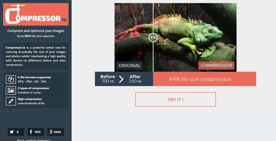
If you are working on a simple static website that only has a handful of images that won't change often or won't change at all, you can just drag and drop your images in one of the numerous online tools. They do an amazing job at compressing images using various algorithms and are more than enough for simple projects.
Most notable websites, in my opinion, are:
- Compressor.io - JPG, PNG, SVG, GIF - 1 file at the time
- Squoosh - JPG, PNG, SVG, GIF - 1 file at the time
- Optimizilla - JPG and PNG - up to 20 images at the time
- TinyPNG - JPG and PNG - up to 20 images at the time
- SVGMinify - SVG - 1 file at the time
- svgomg - SVG - 1 file at the time
Automated solutions
However, if you are working on more complex projects with multiple people and using a lot of images, optimizing each one as it is added to the project can become tedious. Also, there is a risk that some images may end up not optimized due to human error or some other factor.
On complex projects, it's common to use an equally complex build system like Gulp, Webpack, Parcel, etc. Image optimization plugins can be easily added to those build configs and fully automate the image optimization process. Images can be optimized as soon as they are added to the project.
Most notable plugin, in my opinion, is imagemin which can be easily integrated with any CLI or build tools:
Image loading optimization
We've looked at the image optimization strategies that reduce the file size by compressing the image without changing the image resolution and affecting image quality too much. Although optimizing image file reduces the file size of images considerably, having multiple optimized images (on the webshop catalog page for example) loaded all at once can have a poor effect on performance.
Lazy Loading
Lazy loading is a concept of only loading assets that are needed. In our case, only images that are currently within the user's viewport (screen) are loaded. Other images are not loaded until they appear within the user's viewport.
Although native Lazy loading has just been recently introduced to browsers, there have been many JavaScript-based solutions available.
Native Lazy Loading
<img src="image.jpg" loading="lazy" alt="Sample image" />JavaScript-based solutions
Most notable JavaScript-based solutions, in my opinion, are:
Progressive images
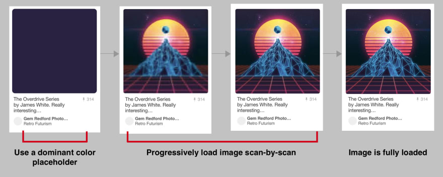
Although lazy loading does a great job performance-wise, looking at the problem from UX perspective we can see that the user is waiting for the image to load and looking at the blank space. On slow connections, downloading images can take ages. This is where progressive images come into play.
Basically, having a progressive image means that a low-quality image will be displayed to the user until a high-quality image has finished loading. A low-quality image has a considerably smaller file size due to the low quality and high compression rate, so this image will be loaded very fast. In between the low quality and high-quality image we can have as many images with varying quality as we need and we can load the higher quality image on each download.
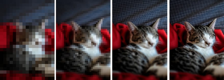
Similarly to the article on Skeleton loading I've written, this technique gives the user an illusion of speed. User is looking at an image that is loading and becoming more clearer as it loads higher and higher quality image, instead of looking at the empty space waiting for something to happen.
This is an JavaScript implementation of progressive images: progressive-image
Responsive images
We also need to be careful of using properly-sized images.
For example, let's say we have an image that is 1920px maximum width on desktop , 1024px maximum width on tablet devices and 568px maximum width on mobile devices. Simplest solution would be to just use the 1920px image and cover all the cases, right? In that case, an user on a smartphone with slow and unreliable connection would have to wait ages for the massive image to download and we'd be back at the square one of the problem.
Luckily for us, we can use picture element to tell the browser which image to dowload, depending on the media query. Although this element is supported by more than 93% of globally used browsers, it has a pretty simple fallback with img element already inside it.
<picture>
  <source media="(min-width: 1025px)" srcset="image_desktop.jpg">
  <source media="(min-width: 769px)" srcset="image_tablet.jpg">
  <img src="image_mobile.jpg" alt="Sample image">
</picture>
Using CDN
CDN services like Cloudinary and Cloudflare can perform image optimization on the server and serve the optimized images to the user. If your website uses a CDN, it's worth looking into asset optimization options. This allows us not to worry about image quality optimization at all, and have all optimizations done server-side. We only need to look into optimizing image loading by either using lazy loading or progressive images.
WebP image format
WebP image format is developed by Google and is an image format specifically optimized for the web. According to the canIUse data, current browser support for WebP image format is at around 80% which is great. Luckily, implementing a fallback to standard jpg image with img element inside picture element is easy.
<picture>
  <source type="image/webp" srcset="image.webp" />
  <source srcset="image.jpg" />
  <img src="image.jpg" alt="Sample image" />
</picture>
Although there are numerous online file format converters that can convert images to WebP format, CDN services can easily perform format conversion server-side.
Optimization for high pixel density screens
This is more UX improvement rather than performance, but it's also important to take into account devices that have higher pixel density.
For example, let's assume that we are displaying an 768px x 320px banner image on 768px screen. But the screen has 2x density and the px width is actally: 2 x 768 = 1536px. Basically, we are stretching 768px over 1536px and this leads to blurry image on high pixel density devices.
In order to fix that, we need to serve an image optimized for high pixel density screens. We need to create separate images that are 2 times or 3 times the resolution of regular screens and use the srcset attribute with 2x tag marking for higher resolution image.
<img src="image-1x.jpg" srcset="image-2x.jpg 2x" alt="Sample image" /> Example - Responsive WebP/PNG images with high-density screen support
<picture>
    <source srcset="./images/webp/hero-image-420-min.webp 1x, ./images/webp/hero-image-760-min.webp 2x" type="image/webp" media="(max-width: 440px)">
    <source srcset="./images/minified/hero-image-420-min.png 1x, ./images/minified/hero-image-760-min.png 2x" media="(max-width: 440px)">
    <source srcset="./images/webp/hero-image-550-min.webp 1x, ./images/webp/hero-image-960-min.webp 2x" type="image/webp" media="(max-width: 767px)">
    <source srcset="./images/minified/hero-image-550-min.png 1x, ./images/minified/hero-image-960-min.png 2x" media="(max-width: 767px)">
    <source srcset="./images/webp/hero-image-420-min.webp 1x, ./images/webp/hero-image-760-min.webp 2x" type="image/webp" media="(max-width: 1023px)">
    <source srcset="./images/minified/hero-image-420-min.png 1x, ./images/minified/hero-image-760-min.png 2x" media="(max-width: 1023px)">
    <source srcset="./images/webp/hero-image-760-min.webp 1x, ./images/webp/hero-image-960-min.webp 2x" type="image/webp" media="(max-width: 1919px)">
    <source srcset="./images/minified/hero-image-760-min.png 1x, ./images/minified/hero-image-960-min.png 2x" media="(max-width: 1919px)">
    <source srcset="./images/webp/hero-image-960-min.webp" type="image/webp">
    <source srcset="./images/minified/hero-image-960-min.png">
    <img  src="./images/minified/hero-image-960-min.png" alt="Example">
</picture>
Conclusion - Optimization priority
- Use optimized images (optimized by automated build tools, online services or CDN)
- Use lazy loading (JS solution until native becomes more supported)
- Optimize images for high pixel density screens
- Use WebP image format
- Use progressive images
Optional: Remember to serve images (and other static assets) over CDN if you are able to.
Thank you for taking the time to read this post. Feel free to share your thoughts about this topic in the comments or drop us an email at hello@prototyp.digital.