We made Skeletor to Simplify React Native Development
A React toolkit that makes development more enjoyable.
A couple of days ago we published our small in-house react-native toolkit called Skeletor. We wanted to rid ourselves of any/all growing pains you have when working on a new react-native project, whether it’s building screen layouts, handling forms, animating stuff on screen or the usual platform-specific pains:
- Tedious project setups
- Cumbersome layout designs
- Repetitive boilerplate code
These things not only eat up valuable time and energy but can also be daunting for newcomers.
Our solution? Skeletor, which is a toolkit crafted in-house at PROTOTYP to cut through the noise and write less repetitive code to focus on coding.
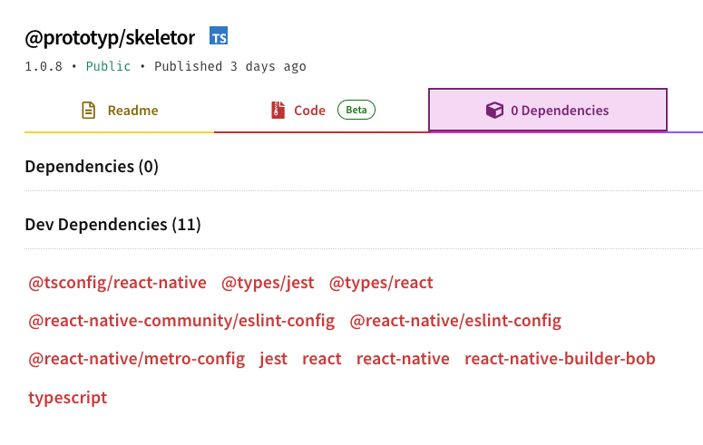
Did I mention that it has ZERO dependencies? Now that I did...
Here's what you get
Efficient Screen Layouts with Minimal Code
One of the first pains in a React Native project is setting up your screen layouts.
- Skeletor's
Screencomponent simplifies this process.
It effortlessly manages safe areas, custom backgrounds, and status bars.
/** Pass a specific background view (gradients, animated backgrounds etc) OR just a background color value. Custom components should be 100% height and width to span the full screen area. */
background?: JSX.Element | string;
hideTopSafeArea?: boolean;
hideBottomSafeArea?: boolean;
/** Set bottom safe area background color */
bottomSafeAreaColor?: string;
/** Set top safe area background color */
topSafeAreaColor?: string;
/** Set device status bar color type. */
statusBarType?: "default" | "light-content" | "dark-content";
isLandscape?: boolean;function Component: React.FC = () => {
return <Screen background={<GradientBackground />} statusBarType="dark-content">
...
</Screen>
}
Now, there is no need for extensive code to handle these elements. You can establish complex screen layouts with a few lines of code.
Streamlined Text Handling
Dealing with text styling can be tiring. It often requires a custom StyleSheet for each variation.
- Skeletor addresses this through its
Textcomponent.
It allows for font name autocompletion and exposes most styling options as top-level props.
/** Inferred from @types/Font.d.ts */
font?: Font;
/** Either define [fontSize, lineHeight] or just one size applied to both fontSize and lineHeight */
size?: [number, number] | number;
textTransform?: TextStyle["textTransform"];
letterSpacing?: TextStyle["letterSpacing"];
color?: string;
textAlign?: TextStyle["textAlign"];
opacity?: TextStyle["opacity"];import { Text } from "./Text";
function MyComponent() {
return (
<Text font="Arial" size={[14, 18]} color="#333" textAlign="center">
Hello World!
</Text>
);
}This reduces the need for elaborate style sheets, enabling you to modify text appearance directly and concisely within the component.
Simplified Layout Building with Block
Creating and managing layout structures is another area where Skeletor shines.
- The
Blockcomponent serves as the fundamental building block for layouts.
It offers direct control over spacing, size, alignment, and more, right in its properties.
/** Determine if Block is scrollable or not. If scrollable, extends ScrollView props. */
scrollable?: boolean;
align?: ViewStyle["alignItems"];
alignSelf?: ViewStyle["alignSelf"];
justify?: ViewStyle["justifyContent"];
flexDirection?: ViewStyle["flexDirection"];
flexWrap?: ViewStyle["flexWrap"];
flex?: number;
width?: number | string;
height?: number | string;
minHeight?: number | string;
minWidth?: number | string;
maxHeight?: number | string;
maxWidth?: number | string;
margins?: {
	marginTop?: number | string;
	marginBottom?: number | string;
	marginLeft?: number | string;
	marginRight?: number | string;
	marginHorizontal?: number | string;
	marginVertical?: number | string;
	margin?: number | string;
};
paddings?: {
	paddingTop?: number | string;
	paddingBottom?: number | string;
	paddingLeft?: number | string;
	paddingRight?: number | string;
	paddingHorizontal?: number | string;
	paddingVertical?: number | string;
	padding?: number | string;
};
border?: {
	borderWidth?: number;
	borderTopWidth?: number;
	borderBottomWidth?: number;
	borderLeftWidth?: number;
	borderRightWidth?: number;
	borderColor?: string;
	borderRadius?: number;
	borderTopLeftRadius?: number;
	borderTopRightRadius?: number;
	borderBottomLeftRadius?: number;
	borderBottomRightRadius?: number;
};<Block
maxHeight="75%"
flexDirection="row"
align="flex-start"
justify="space-between"
>
... ...
</Block>This direct manipulation of layout properties allows developers to build complex structures with straightforward, readable code.
iOS Input Focus Made Easy
A specific pain point in iOS development is managing the focus on input fields. The InputFocusScrollView component in Skeletor elegantly solves this problem. It ensures input fields are automatically scrolled into view when focused, a task that previously required third-party libraries or custom solutions. This component makes handling iOS input fields more reliable and less code-intensive.
Handling Forms and Animations with Ease
Skeletor also simplifies form management and animations. The useForm hook takes care of form states and validation, requiring only custom validation rules from the developer. This significantly reduces the lines of code needed for form handling.
Similarly, useAnimation and useAnimationTimeline hooks reduce the boilerplate code for animations, streamlining the process of creating and managing animations in your app.
Efficient Android Back Button Handling
The useAndroidBackHandler hook exemplifies the toolkit’s philosophy. It offers a straightforward way to manage the Android back button, automatically unsubscribing when not needed.
This eliminates repetitive code and ensures a smoother user experience on Android devices.
Zero Dependency: A Standalone Solution
Perhaps the most compelling aspect of Skeletor is its independence. With zero dependencies, it's built entirely with React and React Native. This means a lighter, more efficient toolkit that doesn't bloat your project with additional dependencies.
Skeletor stays true to its guiding principle: "Making your code short and to the point".
By addressing these specific React Native challenges, it not only simplifies the development process but also enhances the quality and maintainability of the code.
Check the code and examples here: https://npmjs.com/package/@prototyp/skeletor
Thank you for the time to read this! Feel free to share your thoughts about Skeletor and drop us an email at hello@prototyp.digital or shoot us a message on twitter.