Introduction to React Native Reanimated
Your React Native app is not fancy enough? In this tutorial, we will go through the basics of React Native Reanimated 2 library and learn how to create smooth animations that will bring applications to life.


React Native Reanimated
For my graduate thesis, I had to develop React Native application to promote and facilitate public participation in solving problems with the greenery of the city. Since the requirements for the application were simple I had time to experiment with the animations and make my application look cool. After some research, I decided to go with React Native Reanimated 2.
Reanimated is React Native library developed by Software Mansion. Using worklets ( JavaScript code that can be moved to a separate JavaScript VM and executed synchronously on the UI thread ) they managed to offload animation and event handling logic from the JavaScript thread to the UI thread which allows us to create smooth animations without frame drops. More detailed information on worklets and the library itself can be found in the official documentation.
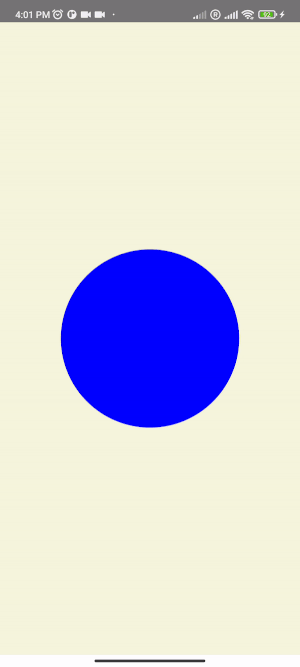
Reanimated in action
Let's create some animations and bring this screen to life!
Shared values & animated styles
For the animation, shared value needs to be created. Shared values are used to maintain a reference to mutable data that can be read and modified across threads since Reanimated 2.0 runs animation code in a separate thread. Shared Value reference is created using useSharedValue hook:
const circleSize = useSharedValue(100);
Next, an animated style that "describes" the animation is created using useAnimatedStyle hook.
const animatedStyle = useAnimatedStyle(() => {
  return { width: circleSize.value, height: circleSize.value };
});
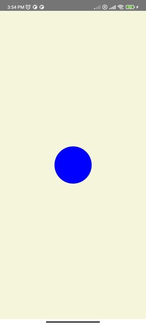
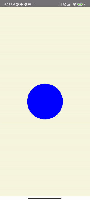
The width and height of the circle are equal to circleSize.value value. On circle press, the value is set to some random number between 100 and 350.
function onPress() {
  circleSize.value = Math.floor(Math.random() * (350 - 100 + 1)) + 100;
}
Animated style is added to the style prop of Animated.View component. Also, additional styles can be added.
return (
  <Animated.View style={[animatedStyle, styles.wrapper]}>
    <TouchableOpacity onPress={onClick} style={styles.touchableOpacity} />
  </Animated.View>
);
For now, the circle jumps to a new size each time it's pressed as presented below:
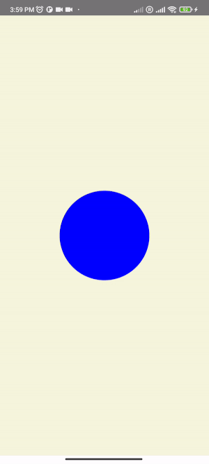
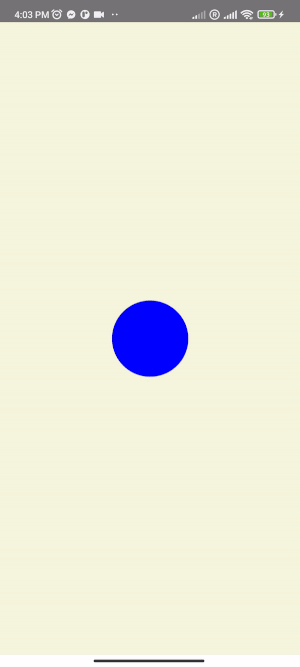
Animation helpers like withTiming and withSpring are used to animate the circle. The onPress() function now looks like this:
function onPress() {
  circleSize.value = withTiming(
    Math.floor(Math.random() * (350 - 100 + 1)) + 100,
    { duration: 200, easing: Easing.inOut(Easing.quad) }
  );
}
Animation helpers can be further modified by passing configuration objects like in the example above. For more details, you can check the animations API reference. The circle is now smoothly changing its size:
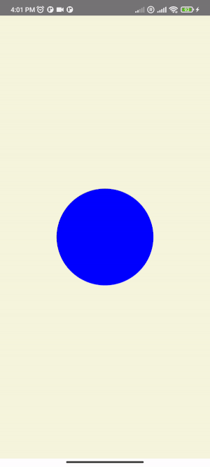
There are also animation modifiers that can be used to further modify animations. For example, withRepeat modifier allows us to repeat provided animation and withSequence allows us to create an animation sequence.
withRepeat example:
function onPress() {
  circleSize.value = withRepeat(
    withSpring(300, { damping: 5, stiffness: 80 }),
    10,
    true
  );
}
withSequence example
const translateXValue = useSharedValue(0);

const animatedStyle = useAnimatedStyle(() => {
  return { transform: [{ translateX: translateXValue.value }] };
});

function onPress() {
  translateXValue.value = withSequence(
    withTiming(-130, { duration: 1000 }),
    withTiming(130, { duration: 200 }),
    withSpring(0, { damping: 5 })
  );
}
Gesture animations
TapGestureHandler
TapGestureHandler component from react-native-gesture-handler is used to handle tap gesture animations. To use gesture handler components event handlers need to be defined. Using useAnimatedGestureHanlder hook worklets for different gesture states such as onStart worklet, which is called when the gesture has started, can be defined. Now the example looks like this:
export default function TapGestureHandlerExample() {
  const pressed = useSharedValue(0);

  const eventHandler = useAnimatedGestureHandler({
    onStart: (event, ctx) => {
      pressed.value = 1;
    },
    onEnd: (event, ctx) => {
      pressed.value = 0;
    },
  });

  const animatedStyle = useAnimatedStyle(() => {
    const backgroundColor = withSpring(
      interpolateColor(pressed.value, [0, 1], ["yellow", "red"])
    );

    return {
      backgroundColor,
      transform: [
        { scale: withTiming(pressed.value ? 3 : 1, { duration: 700 }) },
      ],
    };
  });

  return (
    <View style={styles.wrapper}>
      <TapGestureHandler onGestureEvent={eventHandler}>
        <Animated.View style={[animatedStyle, styles.ball]} />
      </TapGestureHandler>
    </View>
  );
}
interpolateColor is used in the animated style in the example above. What it does is when our pressed.value equals 0 it returns a blue color and when it equals 1 it returns a violet color. withSpring creates a smooth transition between color changes.
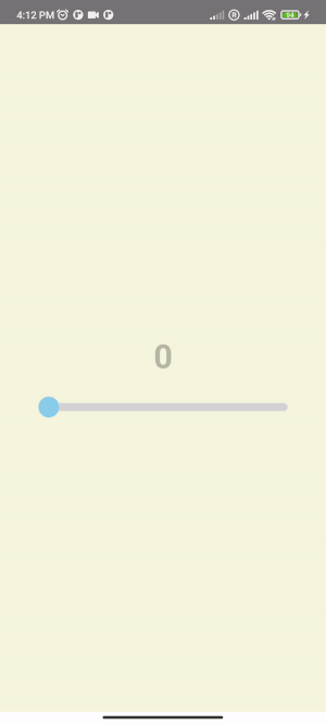
PanGestureHandler
PanGestureHandler is used to handle continuous gestures like the movement of a finger on the screen. When the finger is moved across the screen a stream of touch events is sent to onActive callback. In the next example, the slider component is created. This is what the layout looks like:
<Animated.View>
  <AnimatedText
    style={styles.sliderValue}
    animatedProps={animatedProps}
    underlineColorAndroid="transparent"
    editable={false}
  />

  <View style={styles.wrapper}>
    <View style={styles.slider} />
    <PanGestureHandler onGestureEvent={eventHandler}>
      <Animated.View style={[animatedStyle, styles.ball]} />
    </PanGestureHandler>
  </View>
</Animated.View>
Like with TapGestureHandler, an event handler to pass to our PanGestureHandler component needs to be defined.
const x = useSharedValue(0);

const eventHandler = useAnimatedGestureHandler({
  onStart: (event, ctx) => {
    pressed.value = true;
    ctx.startX = x.value;
  },
  onActive: (event, ctx) => {
    x.value = ctx.startX + event.translationX;
  },
  onEnd: (event, ctx) => {
    pressed.value = false;
  },
});
Notice that in the above example onActive callback is defined which triggers as long as a finger is moved across the screen. Context is also used which is an object that is shared between all the callbacks. It can be looked at like it's a "temporary state". Lastly, animated style is defined:
const animatedStyle = useAnimatedStyle(() => {
  return {
    backgroundColor: pressed.value ? "red" : "skyblue",
    transform: [
      { translateX: x.value },
      { scale: withTiming(pressed.value ? 1.5 : 1) },
    ],
  };
});
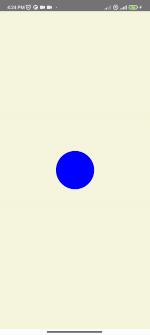
Final result:
Showcase
I would recommend checking out William Candillon's youtube profile which is a great learning resource and full of examples. Here are some animations that I managed to make with Reanimated following his tutorials and other various blog posts:

Thank you for taking the time to read this post. Feel free to share your thoughts about this topic and drop us an email at hello@prototyp.digital.
Happy animating! 😄