Implementing Skeleton Loading in React
The idea and concept of Skeleton Loading or Skeleton Screens was introduced in 2013. in this blog post by Luke Wroblewski.

The idea and concept of Skeleton Loading or Skeleton Screens was introduced in 2013. in this blog post by Luke Wroblewski. It describes the concept of a blank screen where dynamic content is replaced by styled blocks (skeleton) and is replaced with real content once it's finished loading.
Skeleton loading is better than a spinner
When a user looks at the page with a standard loading spinner, they're thinking "I'm waiting for it to load". We're making the user watch a dull repeating animation and the user feels like it's staring at the clock.
When a user looks at the page with skeleton loading or skeleton screen, they're thinking "It's almost loaded, something is happening". The user is watching a page that seems like it's right about to finish loading. User is watching at a page that is not empty or dull, even though we haven't loaded any content yet. It gives an illusion of speed.
But there is something to keep in mind about skeleton loading...
Skeleton loading is used when the final loaded state is predictable
We cannot simply replace every dynamically loaded element on the page with skeleton loading. In some cases, we cannot predict how the final loaded state of the page is going to look like.
For example, if we try and assume a final state of the page (let's say we chose 1 out of 4 wildly different possible states) and create a skeleton screen based on our assumption. When a user looks at the skeleton and the loaded content wildly differs from the skeleton, the transition looks very out of place and jarring. This may hurt the UX and make your app feel chaotic.
Let's assume we're looking at an eCommerce site and we are looking at the homepage. eCommerce homepages often change their look and layout, depending on the events or sales that are going on. It wouldn't be a good idea to implement the skeleton loading here.
Looking at the catalog page, where products are displayed in 4-column layout, with 24 items per page. We can safely assume that this state is not going to change. Even if we finally load 12 or 15 products, instead of assumed 24 the transition remains smooth. Catalog page loading is also very load-intensive (if pagination, sorting, and filters are used) so skeleton loading may also help in keeping the users on the page even in cases when loading times are larger than expected.
Implementing Skeleton loading in React
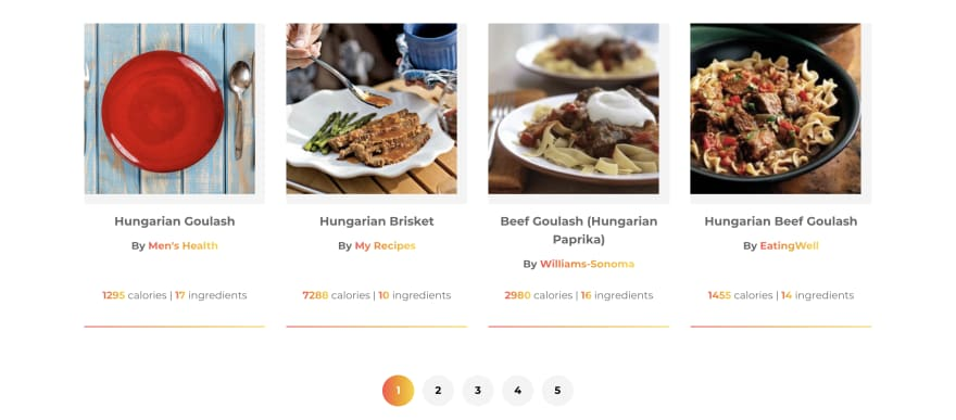
In the following example, we are implementing a skeleton loading for the food recipe card component. This is how the component looks like.
import * as React from 'react';
import { Link } from 'react-router-dom';
import { LazyImage } from 'components';
import { getUri } from 'util/getUri';
export const RecipeCard = ({
calories,
ingredients,
image,
label,
source,
uri
}) => {
return (
<li className="recipeCard">
<Link className="recipeCard__link" to={`/recipes/recipe/${getUri(uri)}`}>
<LazyImage className="recipeCard__image" src={image} alt={label} />
<div className="recipeCard__wrapper">
<div>
<h3 className="recipeCard__title">{label}</h3>
<p className="paragraph">
<strong>
By <span className="gradient--text">{source}</span>
</strong>
</p>
</div>
<div className="recipeCard__info">
<strong className="gradient--text">{Math.ceil(calories)}</strong>{' '}
calories |{' '}
<strong className="gradient--text">{ingredients.length}</strong>{' '}
ingredients
</div>
</div>
</Link>
</li>
);
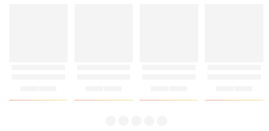
};This is a simple skeleton that doesn't use any animations, just a plain color which also looks fine. You can easily add the animation by animating the background gradient.
First, we need to set up the styles for our skeleton components. We are setting up our base skeleton styles in .recipeCard__skeleton class. We are setting inline-block to mimic content behavior (like alignment), we use padding to add height (equal to 1 unit of line-height, in this case) to an element. We also have two modifier classes that change the width of the content and additional class for an image that has aspect ratio 1:1 (this is why padding is set to 100%).
.recipeCard__skeleton {
    display: inline-block;
    background-color: var(--color__gray--lighter);
    padding-bottom: var(--spacing__vertical--1);
}

.recipeCard__skeleton--medium {
    width: 33%;
}

.recipeCard__skeleton--large {
    width: 100%;
}
.recipeCard__image--skeleton {
    padding-bottom: 100%;
    background-color: var(--color__gray--lighter);
}
Let's create our Skeleton component:
- Copy the content of the "real" component and paste it into the Skeleton component. Change the const name and export.
- Replace all dynamic content (coming from props) to skeleton elements. Spans work fine due to them not having any default styles. Let the layout styles and grids handle everything else and keep the skeletons in place.
- Conditionally load the skeleton in the main component
import * as React from 'react';
import { Link } from 'react-router-dom';

export const Skeleton = () => {
  return (
    <li className="recipeCard">
      <div className="recipeCard__link">
        <div className="recipeCard__image--skeleton" />
        <div className="recipeCard__wrapper">
          <div>
            <h3 className="recipeCard__title">
              <span className="recipeCard__skeleton recipeCard__skeleton--large"></span>
            </h3>
            <p className="paragraph">
              <span className="recipeCard__skeleton recipeCard__skeleton--large"></span>
            </p>
          </div>

          <div className="recipeCard__info">
            <span className="recipeCard__skeleton recipeCard__skeleton--medium"></span>{' '}
            <span className="recipeCard__skeleton recipeCard__skeleton--medium"></span>
          </div>
        </div>
      </div>
    </li>
  );
};
And this is how the final component will look like.
Pretty simple, right? Once you get a hang of replacing the content with skeletons, you can set up a very versatile library of classes for replacing skeleton content and create the skeleton screens really quickly.
Thank you for taking the time to read this post. Feel free to share your thoughts about this topic in the comments or drop us an email at hello@prototyp.digital.